

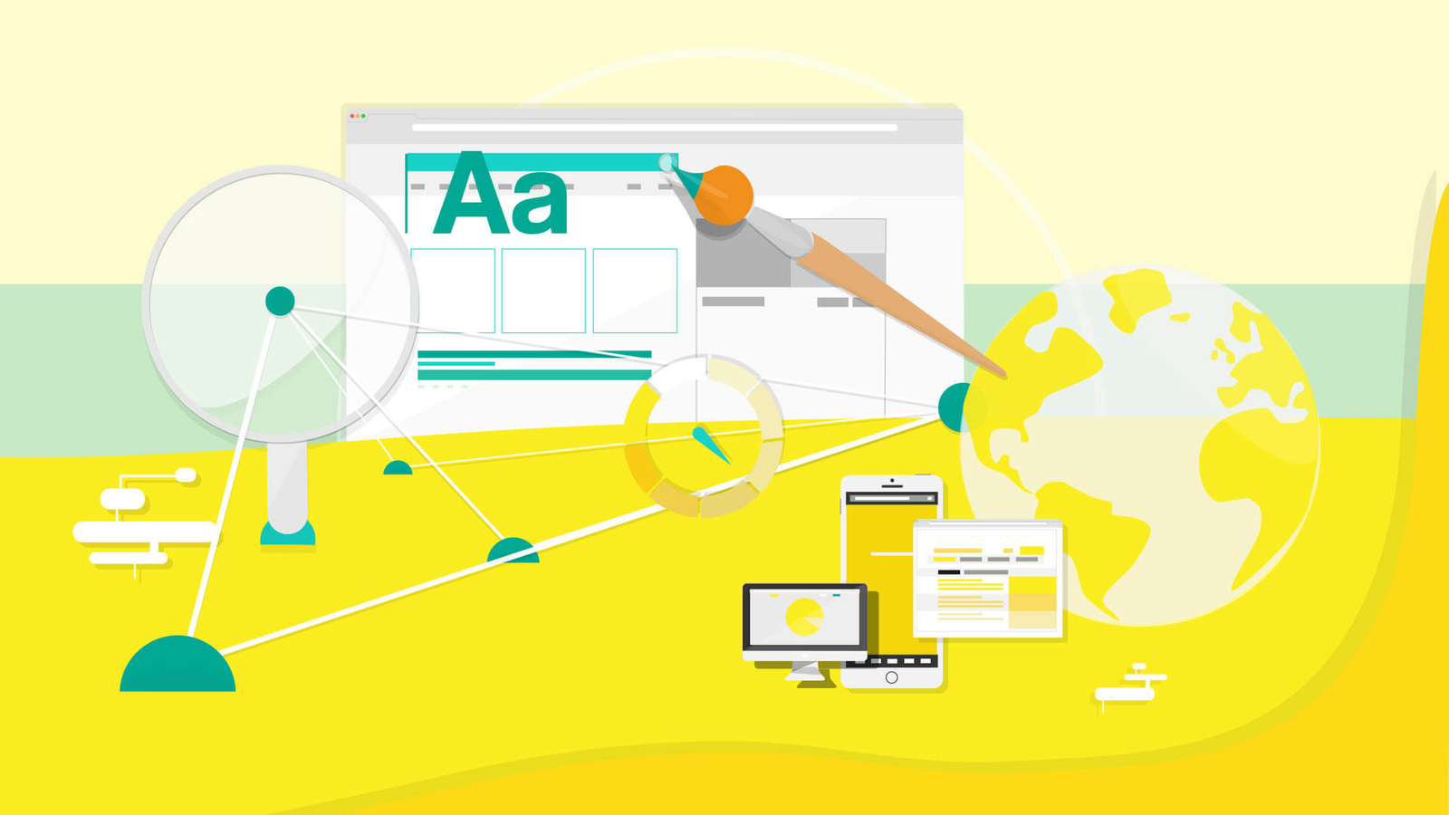
Designing your new website is an exciting step in improving your digital presence. In the past, designers might have focused solely on aesthetics. Today, another important element is requiring website designers to focus on the details behind the design: search engine optimization (SEO).
Designing a website with SEO as a primary consideration can help your website appear more prominently in search engine results, increasing your chances of being found when your potential customers search for information online about products or services such as theirs. In this article, I bring you 6 SEO tips to help your new site stand out.
1 – Create a sitemap and simple navigation structure
One of the first steps in designing a well-optimized website is creating a clear and concise navigation structure. Site visitors depend on your navigation to guide them through the website and provide a higher level of organization for your website content. Creating a sitemap and designing the page structure before designing any page can help you establish how your site will flow as a whole and identify the best way to organize your information so that search engines can easily index it.
2 – Recognize the importance of charging time

A user may never see a well-designed web page if it takes too long to load. Research shows that 11% of users bounce off a page that takes three seconds to load and 38% disappear after five seconds. At seven seconds, more than half the audience is lost. Because even fractions of seconds count, it is essential that all images and design elements are optimized to load quickly and efficiently to help create a seamless user experience.
Start optimizing elements by checking the size of your files. Large files take longer to load; Compressing files (while maintaining image quality) can help your pages load faster.

3 – Use descriptive Alt tags
In addition to optimizing your images, it is important to tag them with a descriptive alternative text. Although users don’t see the alt tags, the search engines crawling your website rely on these descriptions to understand what your images contain and how they relate to your content. The easier it is for a search engine to index and understand your website content, including images, the better the optimized site will be.
4 – Design with Mobile in Mind

Most users now expect a comparable or even improved website experience on their mobile devices. Depending on your target audience, you can choose to focus your website design solely around the mobile experience. Regardless, making sure your website elements run smoothly on both mobile and desktop is essential for an optimal user experience. In addition, a responsive website diversifies your visitor pool through greater accessibility on all devices, creating more opportunities for your site to generate leads.
5 – Prioritize user experience (UX)
A design is only as good as the user experience it provides. Certain design trends come and go, but presenting information in an accessible and digestible way is a tried and true ingredient of website success. It is important to remember that the user experience is built in conjunction with the correct page layout, story, connections, and visual cues. To create the best possible experience for your website visitors, be careful with all of these elements.
In this blog I have many articles related to UX.
User Experience (UX) Design: 4 Essential Elements
The benefits of a Responsive Web Design
An Introduction to Grids in Web Design
6 – Bonus Tip: Tracking and Analysis Settings
It is always good to know how your website is performing, and it is an advantage to know at what level the design elements contribute to that performance. This allows you to make more informed design decisions and make adjustments as needed.

